First Part
Color is an exciting concept that stimulates various emotions in the human brain. We see, understand, and differentiate objects by detecting their color and feeling differently for different colored things. All of us see colors differently because registering colors' visual information happens in our diverse personal brains; therefore, colors are always subjective. But even though they vary from human to human, there are some emotions that the colors awaken in nearly all of us, giving colors generalized meanings.
When we examine these meanings, we come across a critical term: color psychology. The walls of our room when we open our eyes in the morning, the package of coffee we open to put the coffee in our cup, the clothes we wear to leave the house, the buildings we pass by while walking on the street, the posters on the walls of the buildings we pass by, the vehicles we get into, the road signs we see through the road, the trash can we encounter when we get off, and even the cigarette ends that ended up on the ground rather than the trash can talk to us with their colors and direct our feelings throughout the day. You unconsciously smile when you see a person you don't even know walking past you, you look down while walking and feel calm without knowing the reason, you feel a desire for the woman next to you in the elevator without seeing her face, and you trust your coworker who says she will deal with a problem even though you know that she is not so capable working in that area. You do all these on autopilot without even realizing the real reasons behind it.
If you look into the things you experienced a little bit closer, you will notice that some colors have some things to do with them. If you had looked carefully at the man passing by you on the street, you would realize he was wearing a bright orange t-shirt. Even though you didn't see him properly, even with the slightest side-eye look for a second, your brain caught the orange, and the joyful power of orange gave you a millisecond of joy that made you smile.
When you look down, you see the fresh-cut green grass, and you feel relaxed, calmer, and connected to yourself a little bit more because of the powerful color of grass, green.
When the lady got into the elevator, your heart started beating faster, and you connected this with being attracted to her. But one of the main reasons for this attraction was cliche enough, her red dress because **colors can affect your energy and blood pressure.** Studies have shown that an intense red color can speed up your heart rate and raise your blood pressure.
And when your coworker talks to you about a problem, you trust her to solve it due to her earth-toned outfit because brown gives the feeling of reliability.
Of course, I am not saying that colors control all your emotions and that you have no power in your life, but colors are proven to affect human emotions.
Second Part
Designers, aware of the enormous effect the colors create on humans, use colors to attract customers and connect to their user market. Some of the exciting examples of that are as follows:
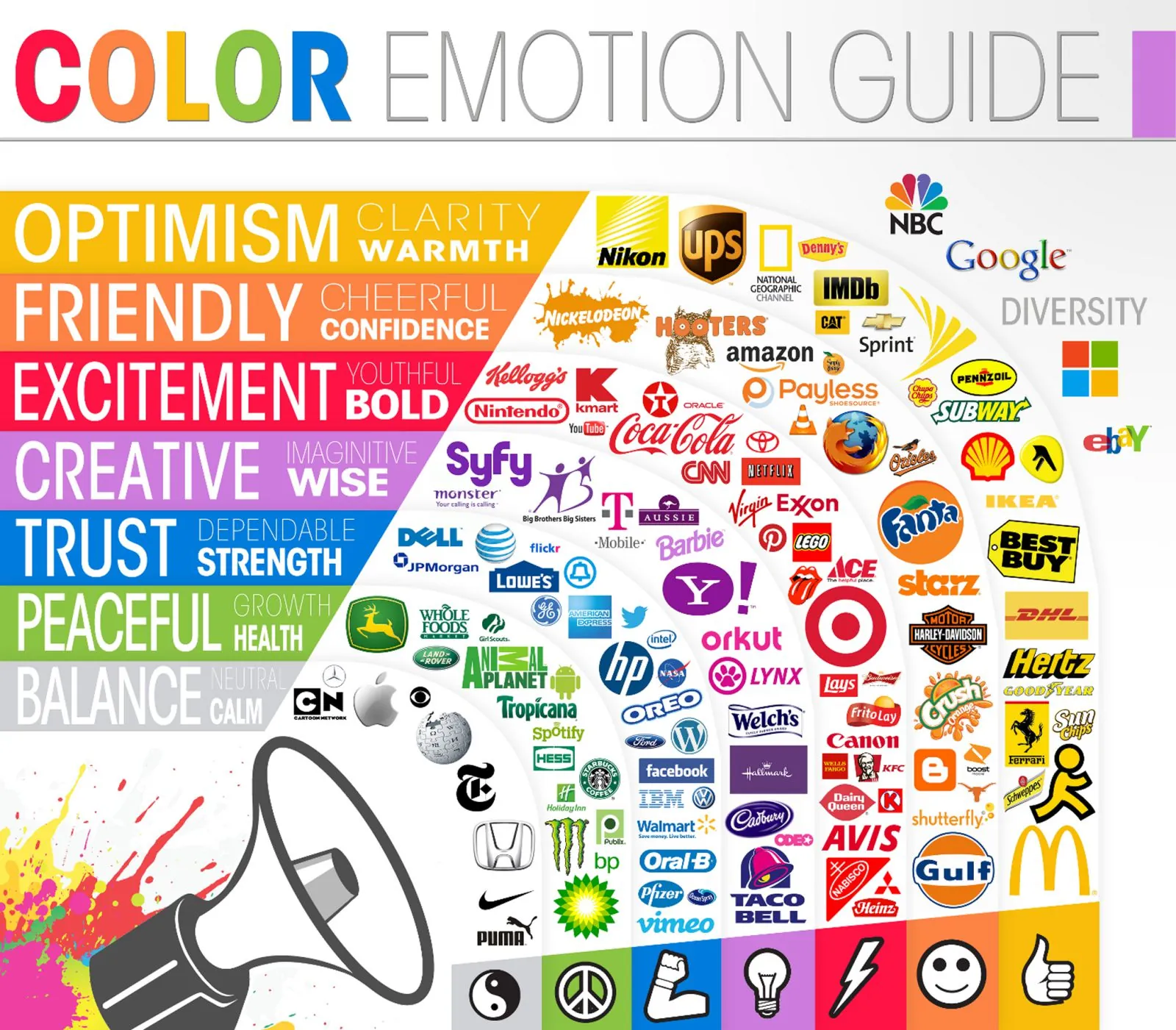
Yellow showcases fun, warmth, and optimism and is used by Ikea, Subway, and Snapchat to attract customers to their warm and positive environment.
Orange is the most cheerful, friendly, and joyous color. Brands like Nickelodeon and Fanta, which base their brand identity on being fun, use this color for their branding and get the user market they want to attract.
Red gives being youthful, exciting, and bold, and the pioneer of red usage in branding is the well-known brand Coca-Cola in which we see these keywords' effect in each of the brand's marketing ads.
Blue is the color of trust and dependability, and we can see the "reliable" brand image of Oral-B and Nivea, whose primary goal is to be seen as dependable for their customers as being health/hygiene brands. Also, technology brands like Dell and HP try to look dependable by using blue because users expect their technological products to be reliable for a long time.
This list goes on and on, and every color evokes different and unique feelings in humans, and these feelings can be used to create an extensive clientele when in good designer hands.
If you would like to learn more about this topic, the Color Emotion Guide by the Logo Company (2020) is a good starting point to start examining brands' color psychology usage on their logos:
 https://coolinfographics.com/blog/2013/10/7/the-color-emotion-guide.html
Third Part
Of course, this does not mean that the colors are only being used in branding, logos, and ads. They are also being used in physical products. One of the best examples of color theory usage on products is using primary colors when designing children's products, such as toys. The main reason behind the usage of highly saturated primary colors on toys is that bright colors are easier for young and developing eyes to see; therefore, many studies show that children prefer bright colors. This preference is why many toy brands design their toys using bright red, blue, and yellows. Still, there is a catch: these colors catch children's eyes in the beginning and push them to buy, but later on, the intense emotions these colors evoke might become tiring, therefore the toy brands that are newly starting to realize this started changing their color decisions and going with calmer colors to be more sustainable.
Also, you can see black, purple, and metallic colors on many perfume bottle designs because they evoke the emotions of strength, luxury, and in the proper context, desire.
When we talk about colors, the only end of the topic is if you stop writing. But to conclude, designers are using color psychology in every product, digital and physical, and to make your designs more appealing, grab the attention of users and communicate what your product is about to the users, I suggest you read and learn more about the color theory and psychology, examine how brands use it successfully, and use it on your own designs, you will not regret it.
References
Psychology Of Color In Logo Design. (2020, December 27). The Logo Company. Retrieved January 27, 2023, from https://thelogocompany.net/psychology-of-color-in-logo-design/https://coolinfographics.com/blog/2013/10/7/the-color-emotion-guide.html